Role: Senior Product & UX Designer. Researcher.
I was part of the App Team at Abercrombie & Fitch / Hollister, focusing on optimizing the current app through insights from user experience research (UXR) and introducing new features and ideas. Collaborating closely with engineering and cross-functional teams, I ensured that the app's user experience aligned seamlessly with the website and mobile web platforms. Additionally, I contributed to the Loyalty team, driving business goals for the web and mobile web while brainstorming strategies to enhance customer loyalty. Alongside product design.
I conducted my own user research, utilizing methods like A/B tests, surveys, and interactive sessions via User Zoom, synthesizing these findings into a cohesive vision using tools like Mural. Furthermore, I leveraged my skills in motion design to create micro-animations for marketing, enhancing the overall user experience with elements of surprise and delight.
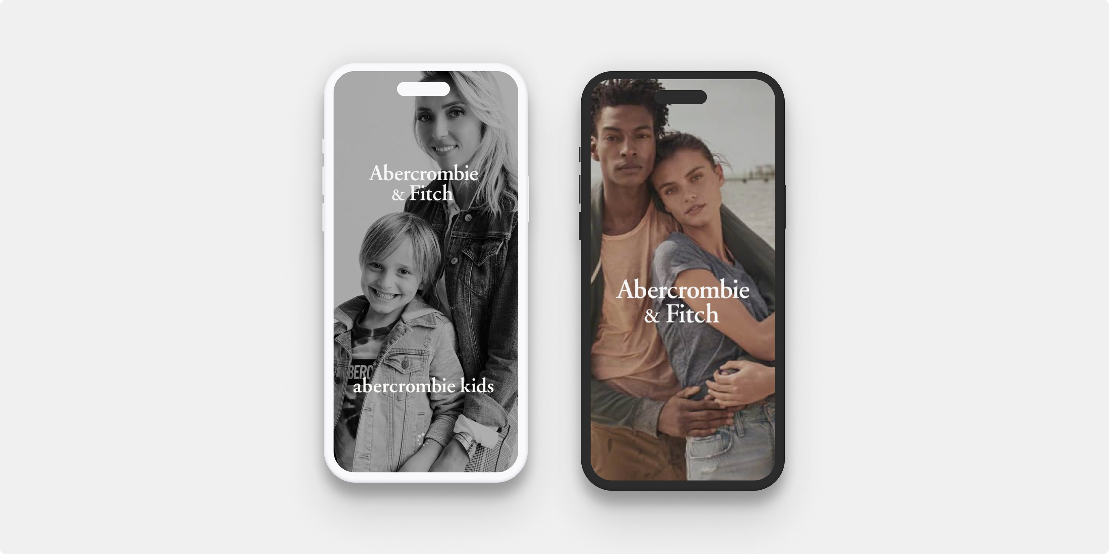
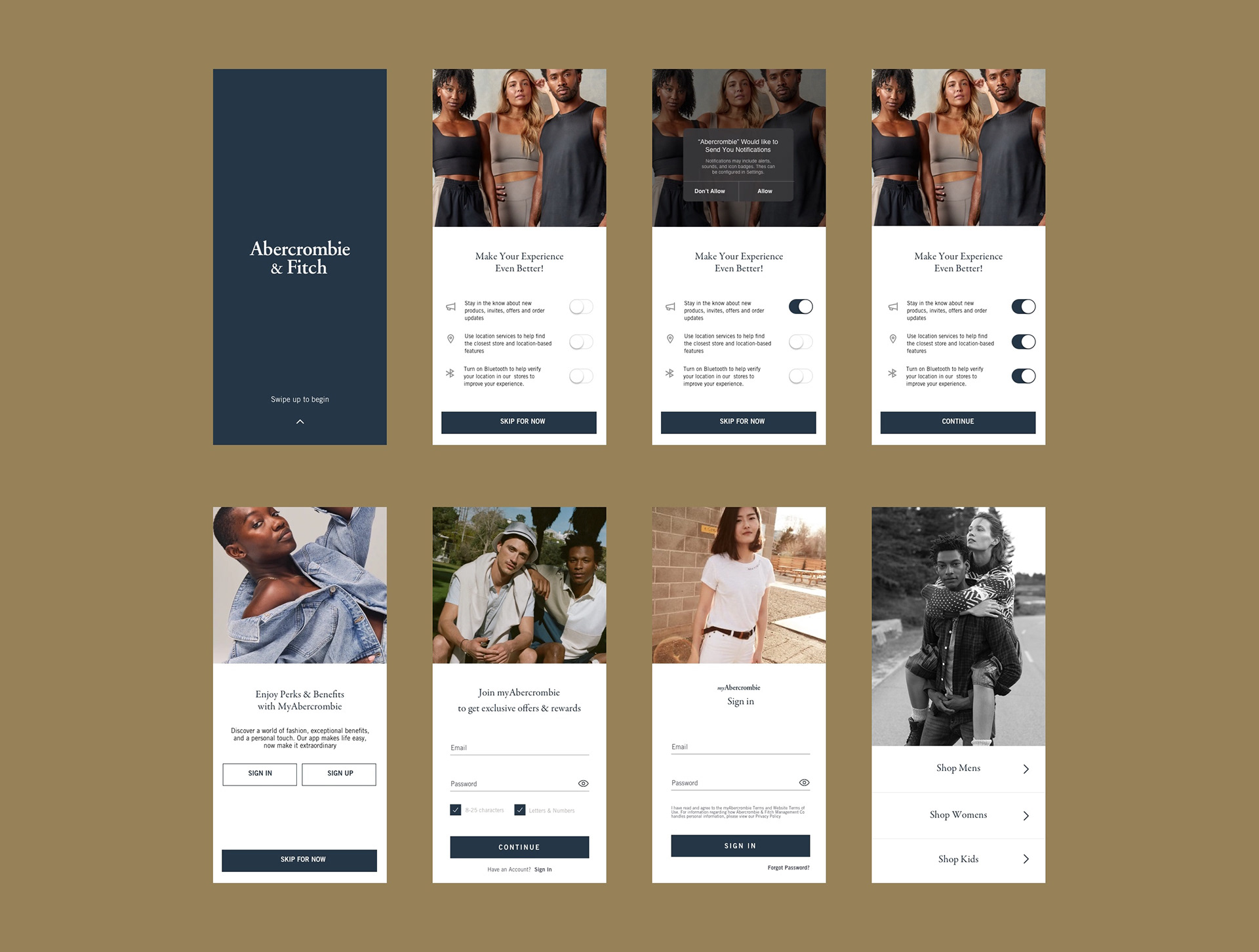
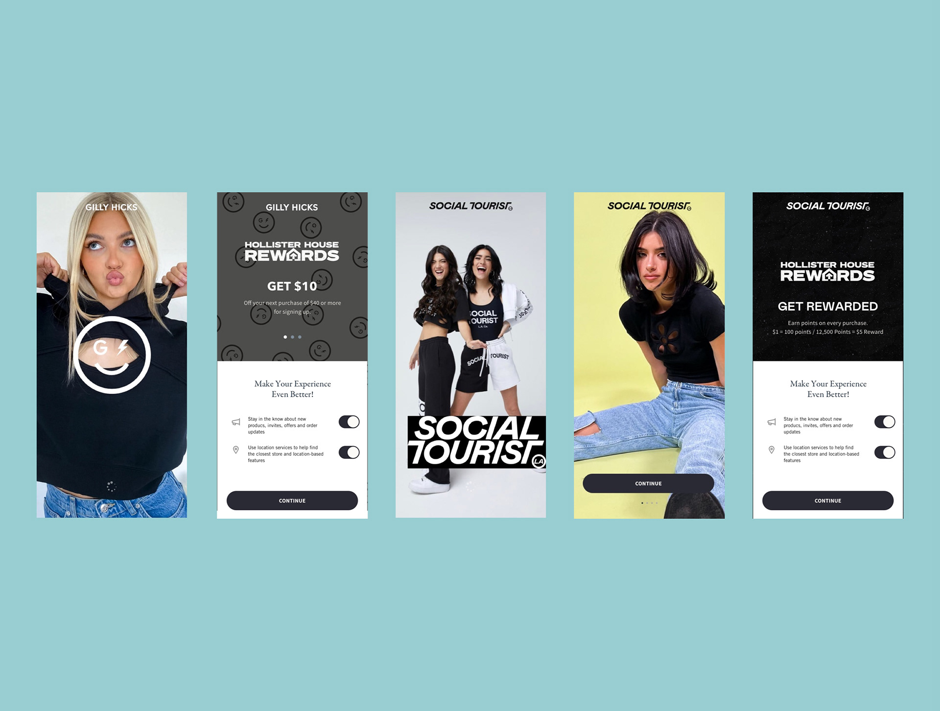
I designed an enhanced onboarding experience aimed at seamlessly introducing users to our new app. Through rigorous testing of diverse implementations, we meticulously curated the final direction. Our revamped onboarding process focuses on delivering a visually branded, clean, and intuitive experience, ensuring ease of use, measurability, and consistency across all brands.

Welcome Screen examples of having a much more branded gateway to the App. Other examples are below of the onboarding flows and designs. These were all tested with users via User Zoom and from the results and data we gathered it resulted in users staying on the onboarding much longer and an increase in sign ups as well.
In phase 1 of the onboarding process, I implemented various iOS native components, such as the bottom sheet, to streamline the user journey. This approach facilitated a swift navigation through the experience, while also incorporating elements of the A&F brand identity through brand imagery and motion, thereby enhancing the overall brand presence on the page. By consolidating the opt-in processes, we optimized screen usage and ensured a smoother and more seamless onboarding experience for users.
Following the launch, we observed a significant increase of over time in sign-ins and opt-ins within the initial month, accompanied by positive feedback from users regarding the revamped experience. Ultimately, users were seamlessly transitioned into the main menu, ready to embark on their shopping journey.
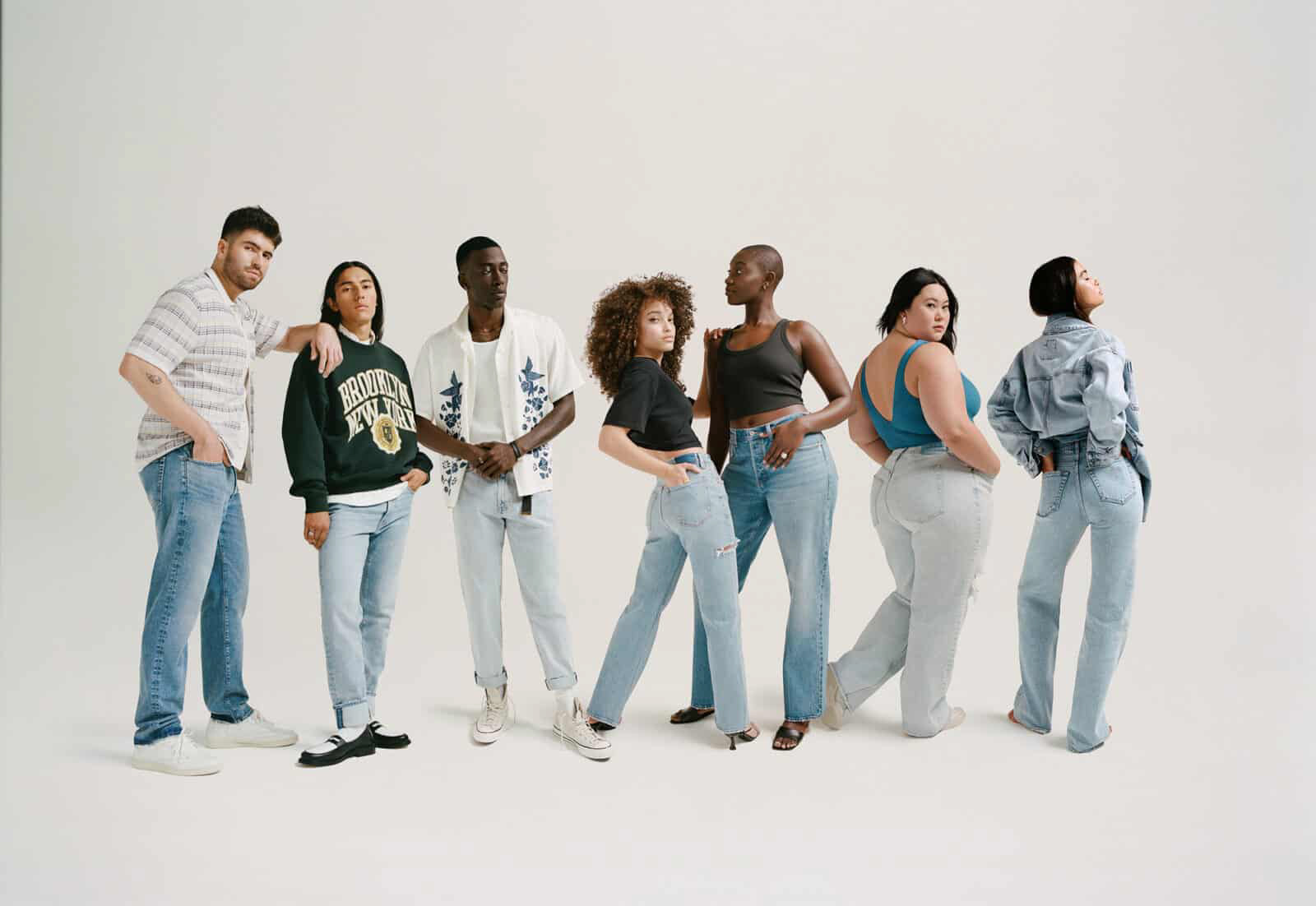
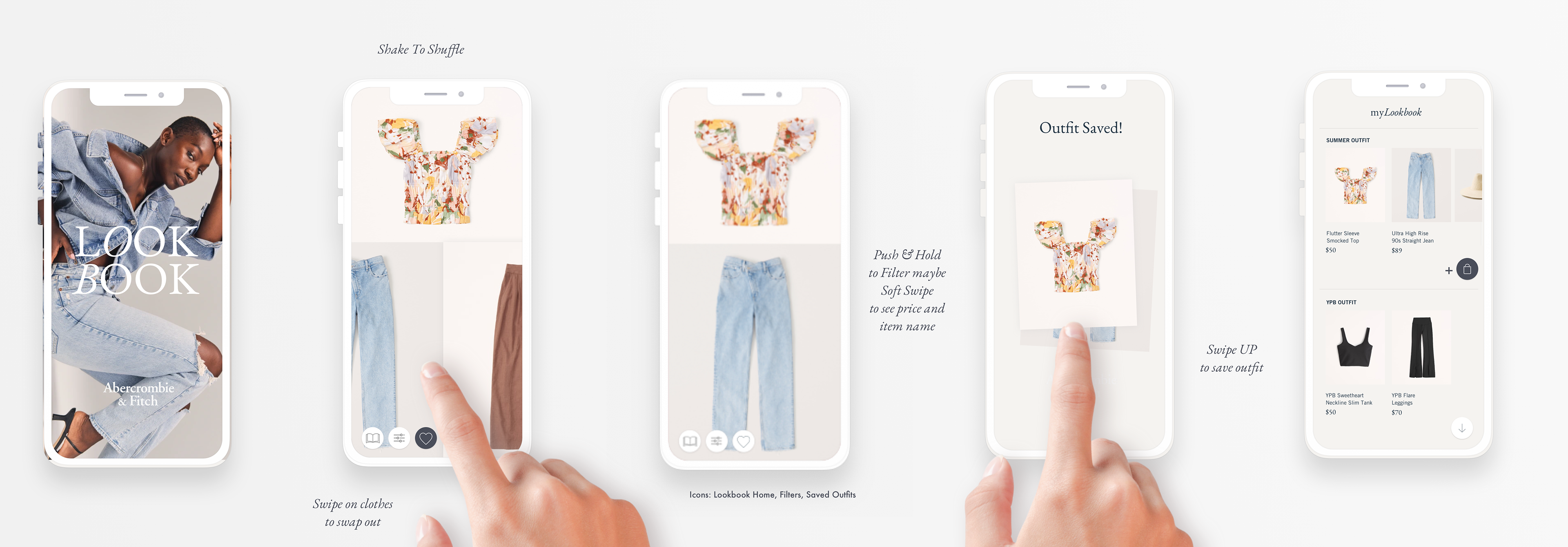
A new feature concept for the App is based on the idea of a Lookbook where users can browse, mix, and match new items in the store, save them for purchase later, and build and share outfits.
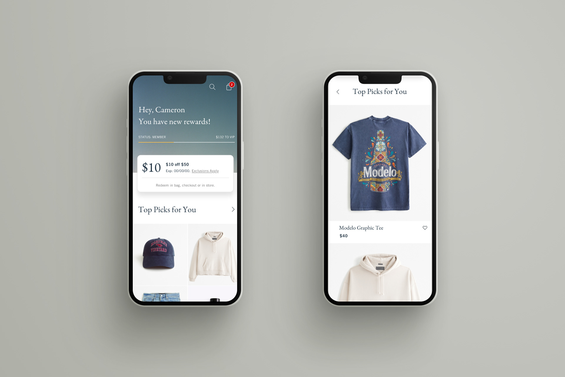
I crafted wireframes and designs to enhance the customer experience on the Loyalty page across Web, Mobile Web, and App platforms. Through extensive surveys and AB testing with users, I optimized both functionality and user engagement strategies, ensuring seamless navigation for tasks such as checking loyalty points, accessing additional information, and encouraging sign-ups.
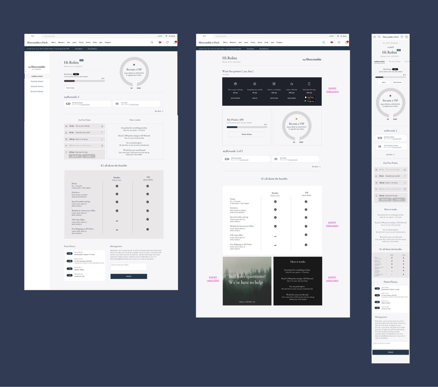
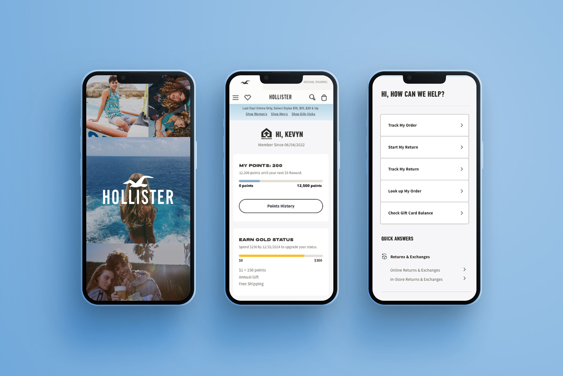
The outcome yielded a more uniform Points bar across both Abercrombie and Hollister Brands, ensuring consistency in the user experience. This dynamic feature provided customers with real-time updates on their points, including insights into how many points were required to attain a reward or VIP level.

App version showing the consistency between the Brands but branded for each app.
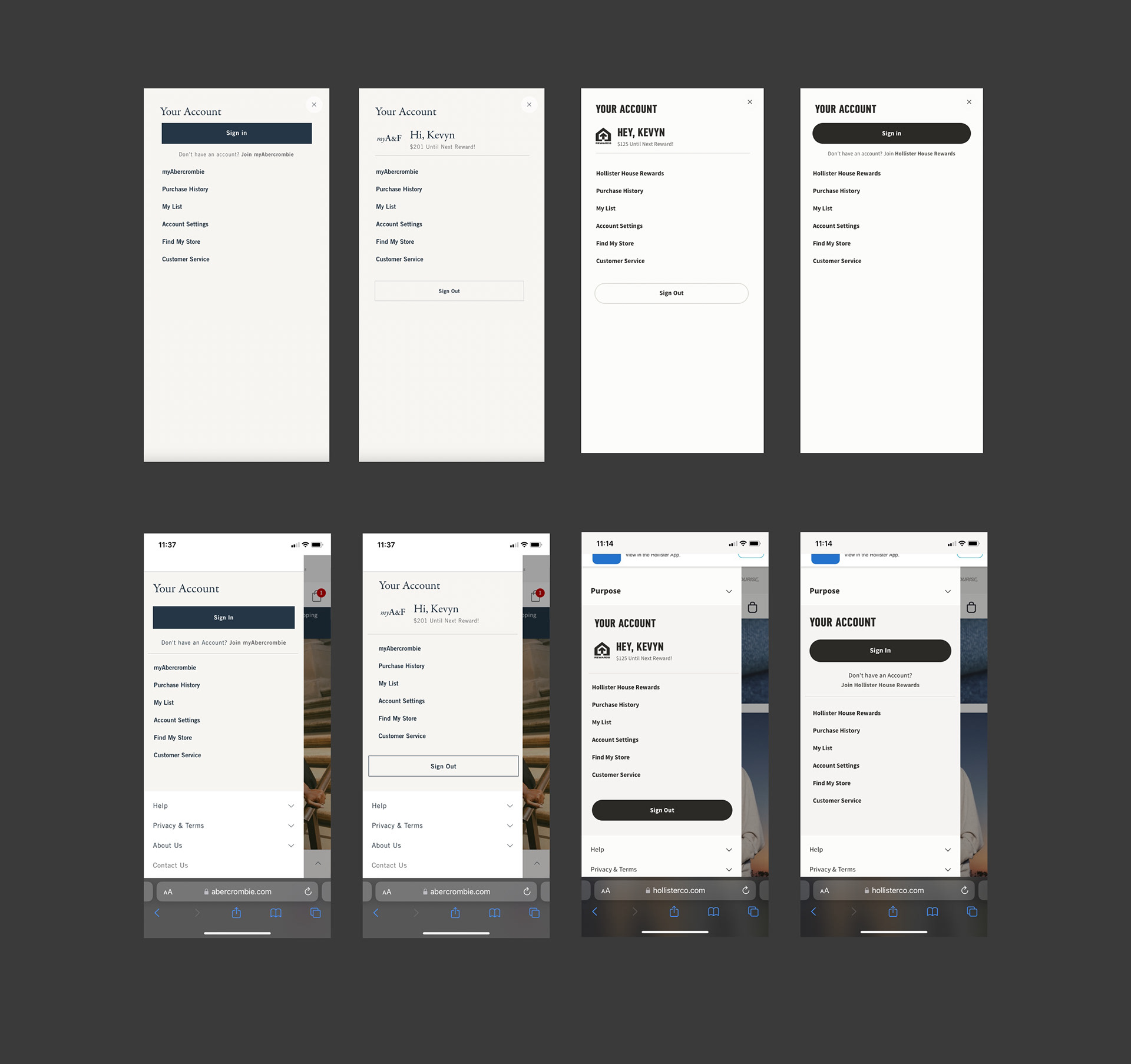
I created low-fidelity wireframes for the Account menus of Abercrombie and Hollister's Toasters, exploring various options such as a side menu or an overlay system. Through rigorous testing, we identified the most effective approach that would give us an uptick in customer visits to these pages and an increase in account sign-ups which met our Business goals and OKRs.
I crafted designs aimed at creating a personalized homepage experience tailored to individual users, delivering products and relevant content that align with their specific needs and preferences.
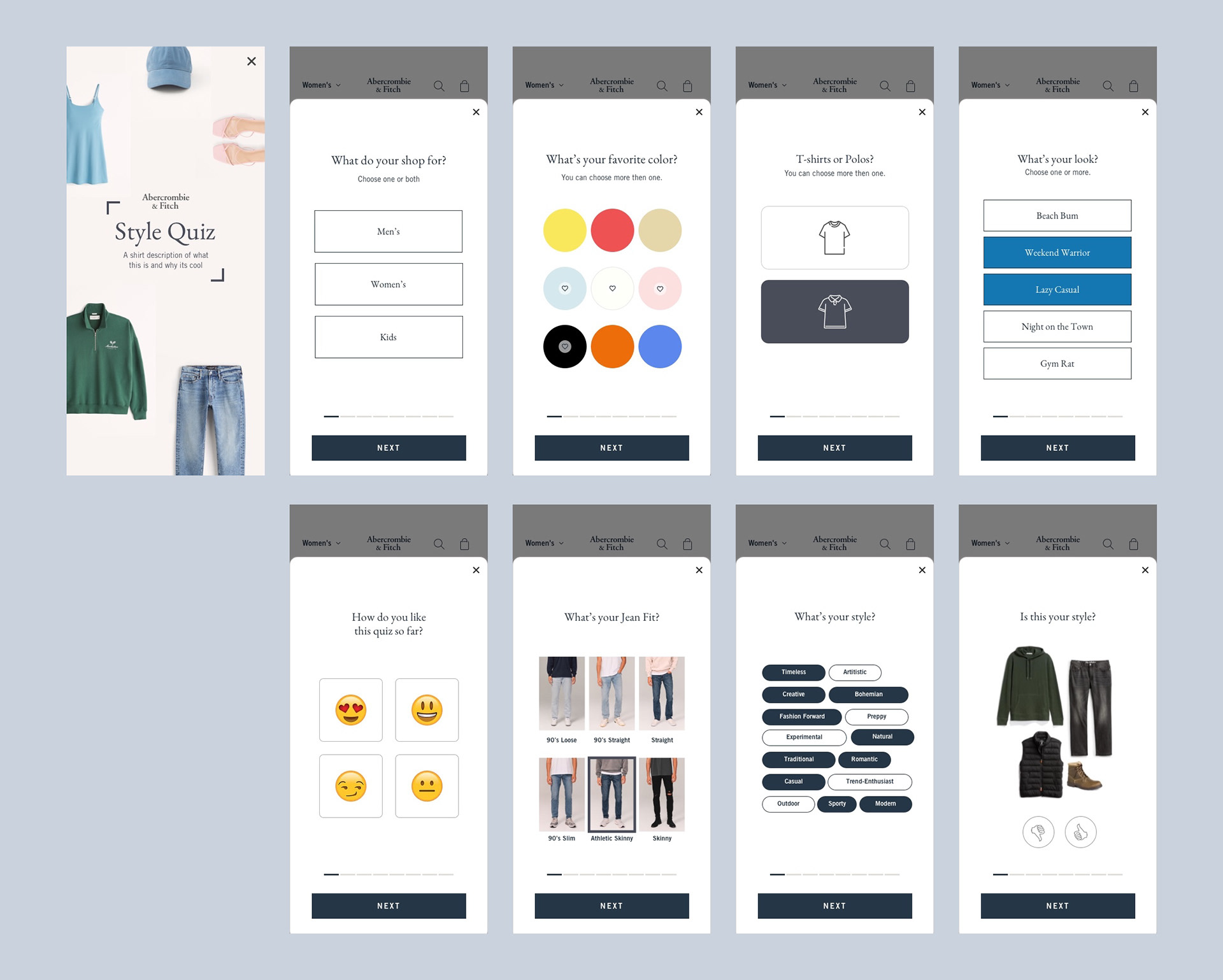
I developed designs for a Personalized Style Guide and Quiz, enabling users to pinpoint their favorite styles, colors, and gather various other attributes. These inputs facilitated the delivery of a tailored shopping experience, inclusive of style tips. Over time, this evolved into a comprehensive style and fit guide. Eventually, we collaborated with a third party to incorporate features like saving sizes, although elements of my original designs were integrated into this enhanced experience.
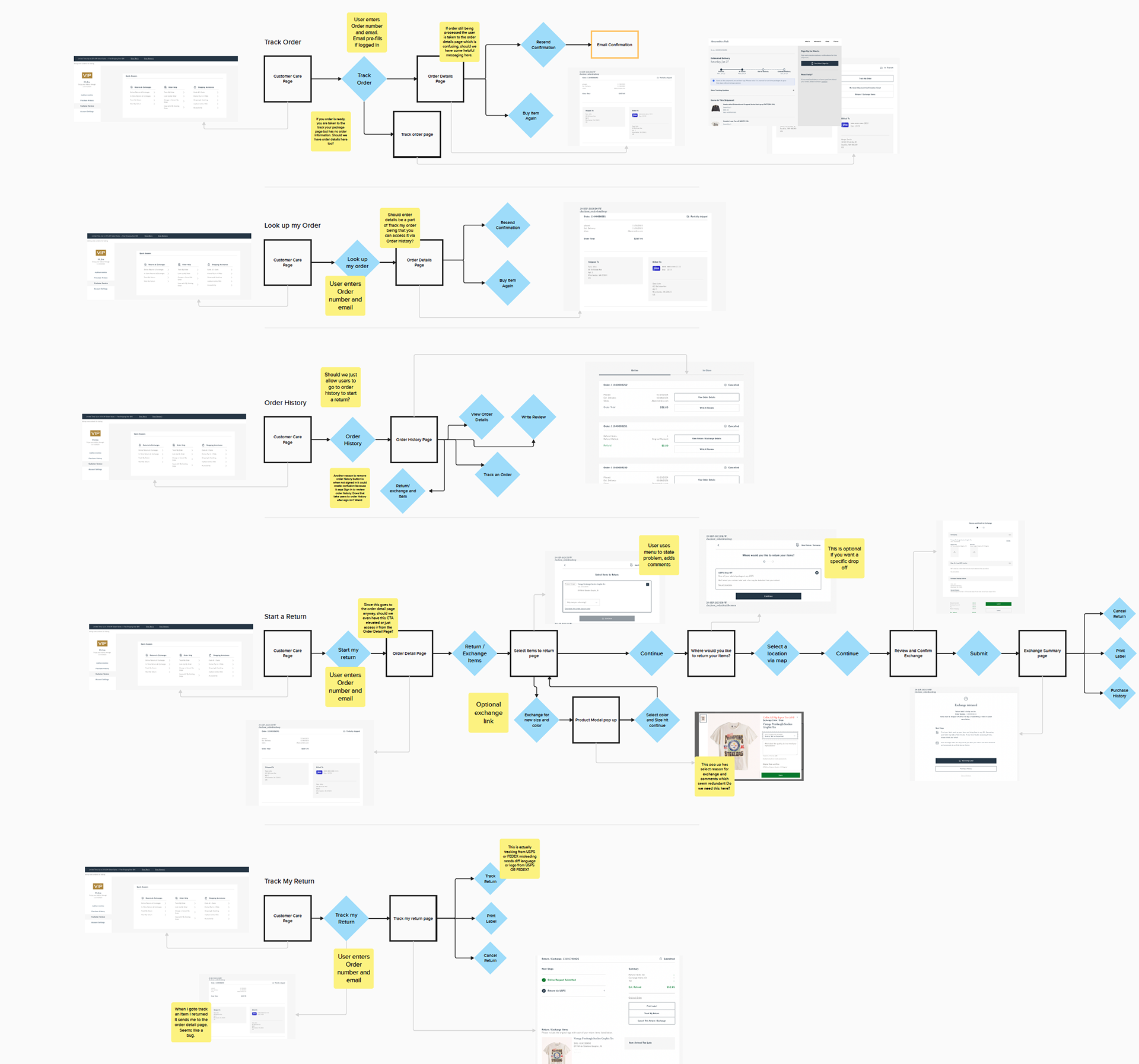
I compiled examples of User Flows and Customer Journeys, accompanied by notes and current screens, to visually depict the proposed new flow for enabling users to access assistance and self-service options such as tracking orders, returning items, or checking the status of a return. Following testing with a select group of users, the outcome revealed a notable increase in users utilizing the new flow to independently address their needs.
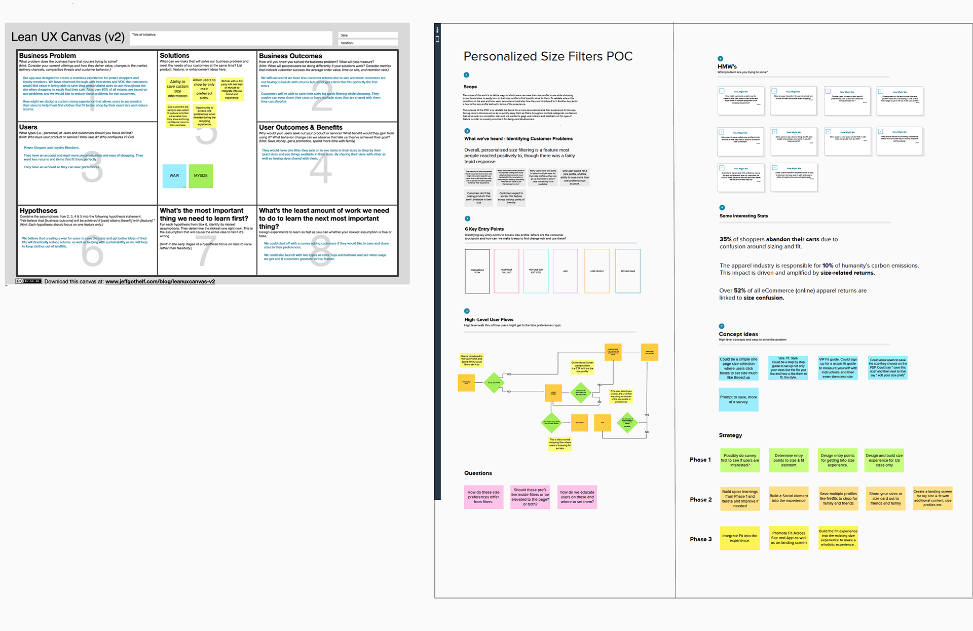
A condensed excerpt from a comprehensive Mural board showcasing my initial research, which encompasses a Lean UX canvas, Scope, key entry points, How Might We's, Voice of Customer insights, and available data. Additionally, it encompasses Concept and Strategy components. While the complete document includes landscape analysis, wireframes, user flows, task flows, and personas, it remains proprietary and cannot be disclosed.
I created an animated promo for Marketing to announce the opening of a new store in London on social media platforms. Utilizing Google Earth Studio, I mapped out the store location and crafted a captivating fly-through sequence. This was complemented with typography and music, offering a fresh and engaging method to inform customers about upcoming store openings. Leveraging Google Earth allowed us to precisely showcase the store's location, providing customers with clear guidance on where they could find us.